Dopamine decorating: feel good colour palettes for your next project
14 Sep 2022
Bold supercharged hues, soft feel-good colours and lavishly patterned wallpapers; designers are embracing elements that evoke a sense of fantasy and other-worldliness.
A growing number of designers and clients are immersing themselves in lively colours that, simply put, place them in a good mood.
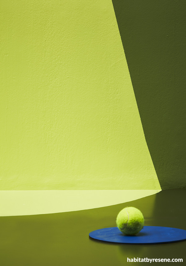
Wall and floor in light green Resene Sublime and dark green Resene Dingley, with the circle in Resene Resolution Blue.
This trend, known as dopamine décor, has taken the limelight, acknowledging a desire for the larger-than-life optimism of colour.
We’re seeing this positivity channelled on the catwalk, with lime-green slip dresses paired with fuchsia handbags and electric-blue shoes, for instance.
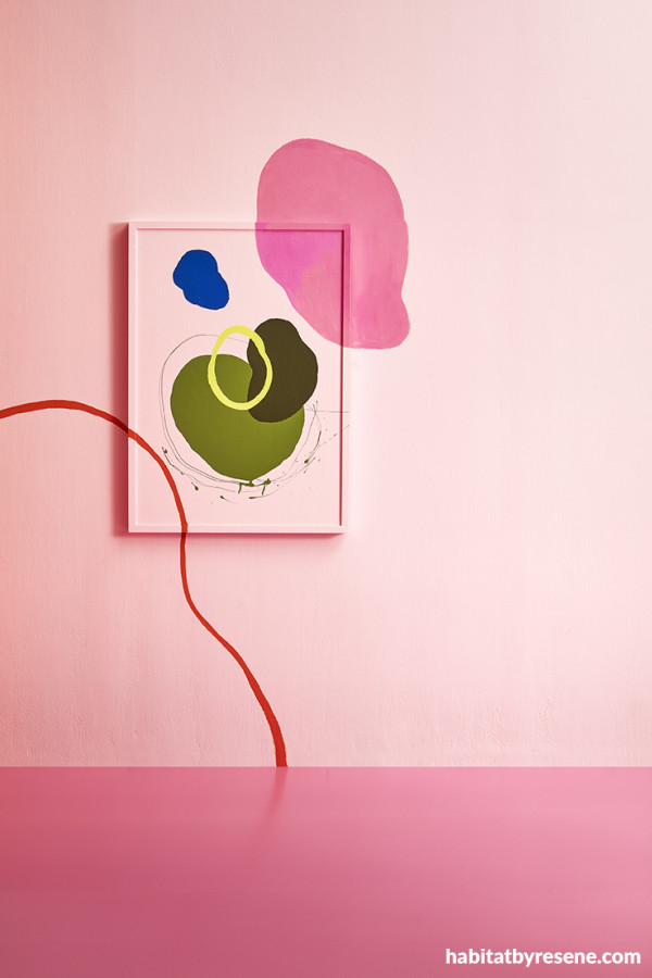
Resene Sublime, Resene Log Cabin and Resene Dingley with the pink hues of Resene Pink Lace and Resene Hopbush.
How easy is this to transport into a client’s interior with the lime green of Resene Sublime, hot pink of Resene Hopbush and the vibrant blue of Resene Resolution Blue?
With dopamine being our pleasure chemical, colours that make us happy enhance just that. The result is a feel-good atmosphere and pleasurable setting that, in turn, feeds our emotions in a way that charcoal or grey may not.
Bright and colourful with an element of fantasy, these are the hues that energise and soothe our frame of mind.
The effect colour has on our emotions, and our psychological response to it, is common knowledge; blue is known for its calming properties, red is associated with passion and yellow evokes energy.
But what’s new with this trend is that, after multiple lockdowns, we’re taking on a new lease of life with bold, feel-good colour in interiors.
With it comes a stronger creative drive and more imagination when approaching colour selections for spaces.
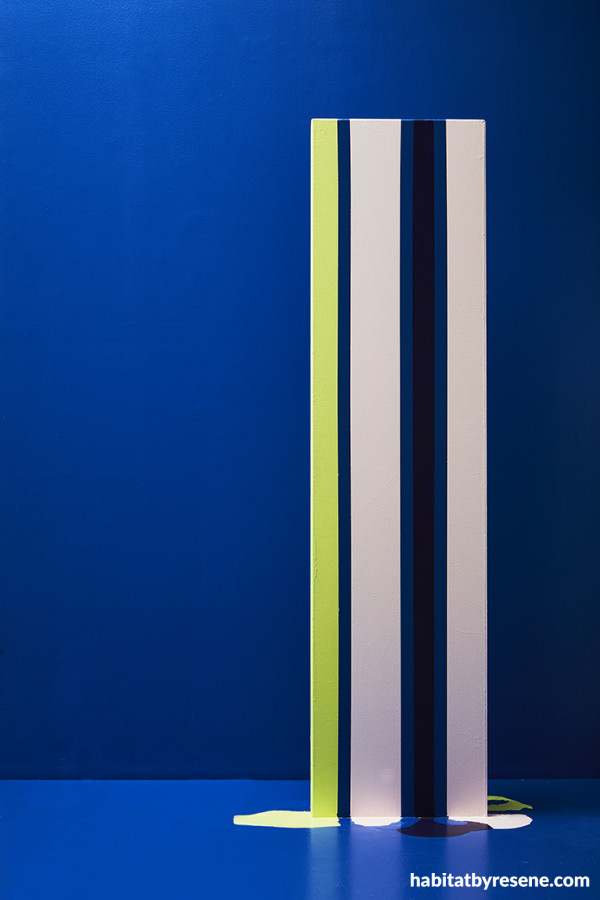
Wall and floor in Resene Resolution Blue with strips of Resene Sublime, Resene Pink Lace and Resene Violent Violet.
More specifiers are opening their ideas up to a greater creative approach with colour, whether towards a large-scale renovation project or simply refreshing a commercial space.
It’s what clients are craving after a period of stagnation, during which it has been a waiting game for the green light to go back to normal life.
Coming out of the gloomy grey days of the pandemic brought a renewed appreciation of our surroundings, encouraging embracing all the colour that life offers and interiors with hues that scream for attention.
We’ve realised just how important happy home, work and leisure spaces are and to consider how to make these spaces work in the best way possible. With colour offering escapism, why settle for an ordinary, uninspiring colourway?
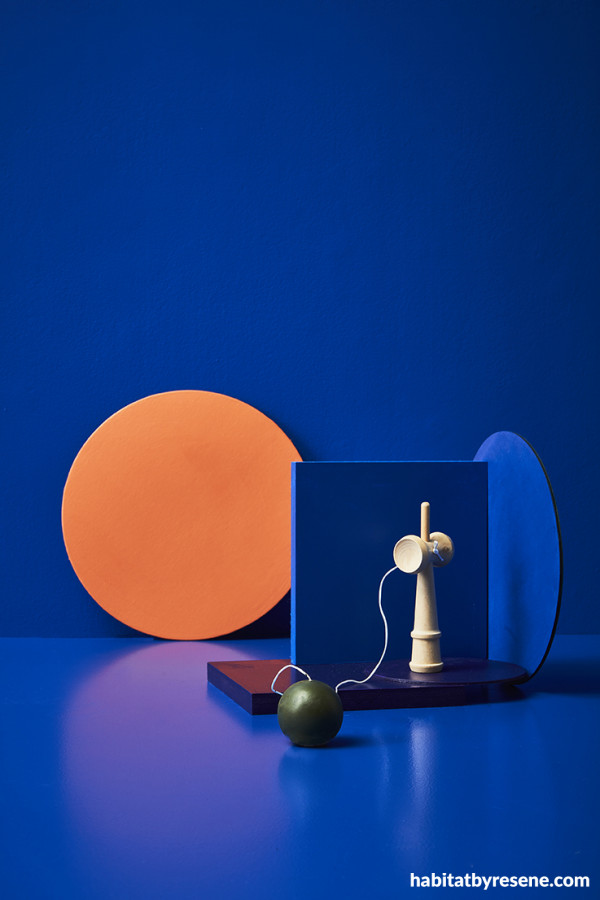
Wall and floor in Resene Resolution Blue with Resene Sebedee on the circle and Resene Log Cabin on the ball in the foreground.
Colour provides clients with a sense of empowerment when choosing their interior schemes. It’s a chance to embody the pleasurable emotions at hand.
While many will associate dopamine decor with bright, flamboyant colours that evoke joy and happiness – think golden Resene Bright Spark, sky-like Resene Havelock Blue and orange-toned Resene Sunrise, others link it with softer, mid-toned colours. These colours, such as Resene Hot Toddy and Resene Perfume are just as optimistic but aren’t as bold.
One tactic is to combine the bright with the subtle, allowing them to balance off one another. A perfect example of this is the rich yellow of Resene Bright Spark with the gentle blue of Resene Frozen or the hot pink of Resene Pink Panther with the more subdued Resene Dust Storm.
Dopamine colours manifest through bright, colourful items against a gentle backdrop, such as jaw-dropping coloured vases, shelves and accessories against a wall washed in soft colour.
Or add another dimension to a soft-hued commercial space by coating just one wall in a bright contrasting Resene paint hue, lively and energetic.
The formula is a maximalist outlook with a daring use of colour. Some clients may embrace the idea of combining this with Resene wallpaper for full effect, tying in perfectly with the larger-than-life nature of dopamine décor.
With dopamine hues, you’ll see contrasting colour realms combining, working together to a happiness-inducing level. Take the sought-after on-trend greens we’re seeing everywhere right now; warm with yellow undertones, paler celery greens, avocados and rich olives are joining forces next to rich raisin reds and coffee browns for a dazzling effect. Pink is also the perfect dopamine partner for green, the winning combination oozing the grounded character of nature and the playful element of pink.
Lilac and orange are a dynamic dopamine duo, such as purple walls with an orange internal door. Expand on this colourway by echoing it in décor throughout the room or office space. Use the rich orange of Resene Sunrise with the bold purple of Resene Studio. Or, for a touch softer, pair Resene Perfume with Resene Guggenheim.
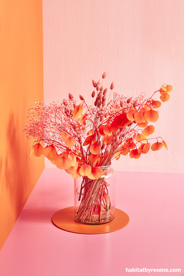
Left wall and circle in Resene Sebedee, right wall in Resene Pink Lace and floor in Resene Hopbush.
When achieving a client’s setting with this good-vibes aesthetic, proportions are key. While making your heart sing with bold colours, a large proportion of one too overwhelming will only bring a headache not happiness. What’s important is to consider the emotional impact these colours have on your client and work from there.
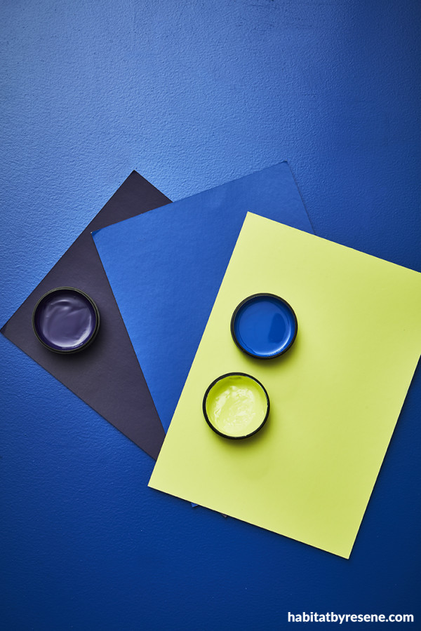
Resene Resolution Blue in the background with swatches and testpots of Resene Violent Violet, Resene Resolution Blue and Resene Sublime.
Channel the bold and brights they emotionally thrive on and gain a psychological boost from. This positive mentality will permeate throughout the interior.
Let artwork and décor drive this vibrancy in their space; for instance, with painting brightly framed canvases and eccentric décor against a wall of colour.
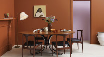
Colour blocking is your friend with dopamine hues as it brings colours together face-to-face. Take terracotta, pink and green – think Resene Glorious, Resene Sakura and Resene Green House; when combined they culminate in a sea of brightness that elevates the mood. Vary the sheen level to highlight a key hue with a gloss finish such as Resene Enamacryl gloss waterborne enamel that will bring out the brightness and optimism of the colour.
While these empowering hues will feel right at home in a client’s home, they’re just as able to lift the spirits of those in commercial spaces, be it hospitality or office areas.
Small doses are a practical starting point if you’re crafting a project for a client who isn’t ready to embrace a maximalist approach. It might be coating the front door, interior doors or even just doorways in a bold hue, such as Resene Kamikaze or Resene Sunshade, allowing their confidence to grow.
Bearing in mind how playful shapes can be, fluid or geometric in form, joyful bursts of colour against a subdued background can be an enjoyable place to start for clients new to colour. Cluster a group of shapes in varying brights in dining or living spaces above the table or couch, a rainbow of colour worthy of display.
By embracing these sunny skies rather than the safe neutrals of yesterday, we’re inviting in the transportive cocktail of colour that lets our positive emotions come into play so vividly. A little dopamine colour is all your need to elevate a space.
Published: 14 Sep 2022





 look book