
latest
habitat tv

Say goodbye to the morning scramble for keys, coats and sunglasses and hello to this… see this and more videos
blog

Award-winning mural aims to bring nature to the city
Auckland artists Kim Littlejohn and Carol Green recently unveiled their new mural 'Bringing nature to… more
Cafe channels Tamahere's heritage with boldly coloured mural
14 Sep 2022
There’s something powerful about the potential of paint colour in a commercial space; not only does it have a decorative role in fulfilling a client’s interior, it can also play a narrative one, anchoring it to its location.
Channelling the history of the area, Forever Bound café in Tamahere, near Hamilton, sought its inspiration from the Waikato and Waipa rivers in its interior concept.
The client’s brief was for a unique style café compared with what is in the market. “Our client wanted a creative space with a story to tell,” Designer Jo Pennycuick from Redesign Group, who crafted the space, says. “Every element within the café was well thought through and communicated. Our client was conscious of the design integrity and building the space to reflect our renders and design.”
Jo says the café’s name, Forever Bound, was inspired by the area’s history, and this tale dictated the use of colour.
“The meaning of the name Forever Bound is quite beautiful,” Jo says. “Tamahere’s location is at the junction of the rivers. The story behind the meaning of Tamahere (which she says translates from Māori as ‘bound boy’) tells the tale of a woman, Mahinaarangi. Walking across the Waikato River, Mahinaarangi lifts her son, Raukawa, on her shoulders to stop him from drowning as she crosses. She says that ‘where the rivers meet is forever bound’.”
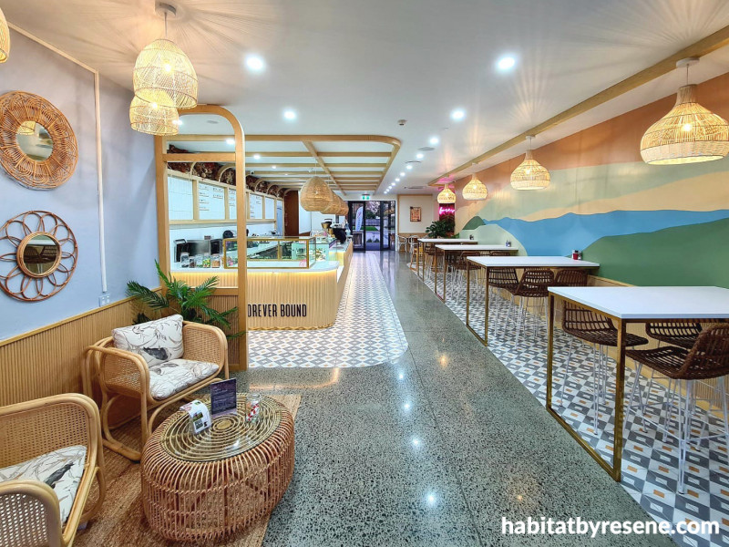
Where this is most eye-catchingly illustrated is on a mural covering the length of one wall painted in Resene colours.
In true eye-catching form, the mural makes a statement using Resene Moscato, Resene Coriander, Resene Paddock, Resene Blue Moon and Resene Baroque.
These Resene colours were selected to embody the beauty and muted hues of the Waikato River and landscape to tell the poignant tale of Tamahere, Jo says.
“Resene has an extensive range of textural colours, which enabled us to select colours to suit our design scheme,” she says. “Resene Baroque and Resene Moscato are beautiful terracotta and cream, which were the main colour focus of our mural, representing the warmth in the skies of Tamahere at sunrise and sunset. The tonal greens and blues of Resene Paddock, Resene Coriander and Resene Blue Moon form a colour palette that worked cohesively in representing the banks and waterways of the Waikato River.”
Customers can dine beside the mural depicting landscape elements, taking in the visual narrative. “The tale has been written on the café wall so the customers can learn and understand the meaning behind the brand story.”
By contrast, a feature wall was crafted using Resene Kingfisher Blue and Resene Concrete mixed with a limewash effect, the result being a calm, serene seating area. “The colours and paint effect were chosen to reflect the stones that are found along the riverbank,” Jo says.
“I’ve been in the business for 24 years and have always used Resene paints,” Jo says. I never deviate from it; even when I carry out work overseas, I always reference a Resene colour. We know Resene products well, and the colour ranges are always on point. We also have a great rep down here, who always keeps us updated.”
The café is part of a broader complex, including a restaurant, The Boundary and wine store, all of which have their character under a united aesthetic linking with the story of Tamahere.
“As well as the large mural on the side wall, the way the white oak timber elements curve pay homage to the shape of the Waikato River and the presence of the wall of dried flowers bring in references to the riverbed planting rusts and earthy tones.”
What softens the painted setting while complementing its nature references is this wall of dried flowers, crafted by a local flower arranger, with the words Forever Bound bursting in a pink neon light. “We used tussocks and flax-style planting in rusts rather than greenery to tie in more of the earth plants around riverbed instead of random planting. The neon pink of the words Forever Bound provides a pop of colour. Lighting is essential from an operational point of view. In addition to this, we have mood pendants over the counter and supporting task lighting, which is dimmable, over the rest of the café. We also use the space in the evening, so we had to make it flexible.”
As with any new brand, Jo started with developing the logo and brand colours. The mural colours were derived from the tones of the land, Tamahere ranges and the intertwined rivers. Then, throughout the remainder of the café, the clean tone of Resene Quarter Spanish White sets a fresh base for the layers of décor on top. “This neutral base allowed us to then add other colours that would pop,” Jo says. “We tend to use neutral bases then layer other elements on top.”
Texture then finds its way in through tonal timbers, wicker, mirrors and fabrics in different colour ways, as well as concrete and patterned flooring.
The result is a space that uses texture in neutral tones to craft a soothing space for its customers. “It’s very welcoming and calming; all the finishes relate to each other in neutral tones,” Jo says. “A lot of people may not understand the true elements of the space, but we’ve tried to bring that through into the storytelling of interior. The interior combines vibrancy and neutral colours that relate well. If you look at how the joinery has been designed and flows, it is curved with no hard edges.” The curves of the fluted front counter cladding and ceiling features mimic the river and echo the curved seating.
“The curves and flow of the interior welcome customers into the banquet seating. There is a natural progression for customers to feel welcomed as they transition through the space to where they want to be. Our work is mainly overseas, and these same traits are repeated there.”
With company working for international clients for 18 years, the majority of their interiors appear in airport facilities in the Middle East and Southeast Asia with franchises such as Jamie Oliver and the Hard Rock Café. “What you see in the café in Tamahere is where our design is heading in the offshore market. Yes, we work in New Zealand, but many of our work traits are brought to the offshore market.”

Bold use of colour in Forever Bound’s wall mural tells the tale of the Tamahere’s beginnings, with Resene Moscato, Resene Coriander, Resene Paddock, Resene Blue Moon and Resene Baroque.

Resene Quarter Spanish White pairs with white oak timber panelling to create a calm, fresh base for additional décor. A feature wall of dried planting pays homage to the local riverbed planting, using natural tones that contrast playfully with the neon lighting.

The seated area evokes a tranquil setting thanks to Resene Quarter Spanish White on the walls and ceiling, paired with navy and pink soft furnishings.

Channelling a less-intense version of the blue that appears in the mural, Resene Kingfisher Blue was mixed with limewash on this feature wall near the café’s entrance.

Flowing lines on the café’s flooring combines concrete and patterns, each providing texture but staying in keeping with the neutral palette of the interior.

Curved structural lines echo the flow of the river that drove the interior scheme. Resene Quarter Spanish White and wicker pendants extend this softening effect further.
Published: 14 Sep 2022
more inspiration

Resene Webinar – Overview of Concrete Walls and Floors
Join us for a free webinar on Thursday 18th April 1-2pm… more

Te Pūtahi releases programme for the festival of architectural excellence: Open Christchurch 2024
Open Christchurch 2024, supported by Resene, celebrates some of Christchurch’s… more

How to blend trends and timelessness through transitional design
If you have ever found yourself on the fence about… more

Restoring splendour: The Oamaru Opera House Dome project
In the town of Oamaru, New Zealand, the Oamaru Opera… more

What is your role at Resene and what does it… more


 look book