
latest
habitat tv

Say goodbye to the morning scramble for keys, coats and sunglasses and hello to this… see this and more videos
blog

Precision and vibrancy with artist Cap Jacobs
Cap Jacobs is a New Zealand-based artist whose work stands out for its precision, vibrant… more
 look book
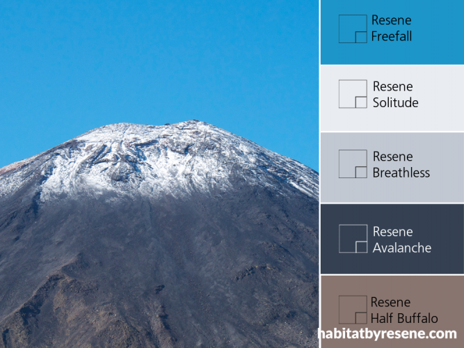
From a scenic hike through the Tongariro Crossing comes this breathtaking view. Bring it indoors with a palette of cool and dreamy Resene Solitude, splashes of vibrant Resene Freefall, and a dusting of Resene Breathless.


The ever-wonderful cherry blossom tree, and its dappled shades of pink, is our signal that spring has arrived – and with it, new beginnings. The soft pink tones of Resene Abercrombie, Resene Pink Terrace, Resene Sweet Spot and Resene Boutique are anchored by textured vinyl planking by Harrisons CarpetOne (code: Traffic 5626001).

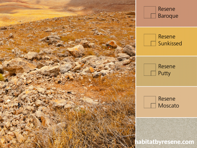
Rocks and suntanned tussock soak in the warmth of the sun, creating a palette of golden hues and beige-y neutrals. Think rustic tones of Resene Sunkissed, creamy Resene Putty and Resene Baroque, a gentle sandalwood beige. Layer with this creamy Capri 500 carpet from the Zen 3 range at Harrisons Carpet One (code: Capri 500).

Let nature lead you
Many successful interior colour schemes take nature as their inspiration, and in a country such as this where we have such abundant and interesting natural settings, why not? If it looks great beyond the window, chances are it will look great inside.
Put your preconceptions aside
So ‘natural’ schemes are brown and green, right? Nope. Well, some of them may be by taking their lead from rock, earth, foliage and bush. But there are many more aspects of nature from which to take your cue – flowers of any hue, high-country tussock, rivers, clay, grey river pebbles, deep bush or more secondary scrub lands, the Central Plateau, mountains or volcanos with their bright azure crater lakes, sunrises and sunsets. And of course, our vast stretches of coastline offer a wealth of inspiration – white sand, black sand, sea, surf, shells, kelp and seaweed, shoreline plants like grasses and toi toi, rocks of all colours.
You may think that using leaves or trees as inspiration for a fresh green scheme makes sense but the true colour of many types of ‘green’ foliage is much muddier and muted than you would think. There are few very clean clear greens in nature, which is why those who think that painting their fence a grass green will help it blend with the garden get a rude shock. The colour that does this is more like a licorice (almost black) green which merges with the shadowy areas of a garden border.
The same can be said of many of nature’s colours – aside from the most vibrant flowers, bluest skies or glowing sunsets, natural colours are soft and muted not clear and bright. Which is why we find colour schemes inspired by nature so calming.
Work on texture and tone
Colours in nature are rarely one tone only. You may see a flower as pink but look closer and there will be variations of pink, from outer older petals through to the pearlescent throat of the flower. The same can be said of bark, rock, earth, leaves… anything really.
And few natural objects are one texture. Think rough earth, knubby bark, smooth river pebbles, glossy leaves, satiny petals, glimmering shells…
Proportions and placement
Let nature lead the proportions of colour you use. In nature, the ground plane is often dark (earth), while the middle is lighter (bush, trees, landsape) and the top is light (sky and clouds). These sorts of intensities traditionally translate to your room – a darker floor covering, mid-toned walls and a pale ceiling. Imagine how odd it would feel having a dark brown ceiling and white floor; we’re just not used to it.
Top tip: To use your own nature photos for inspiration, load them into the Resene Colour Palette Generator and it will suggest some Resene colours for you to help get you started. See www.resene.co.nz/picturepalette
Published: 24 Sep 2014
Do you have a home full of wonderful Resene paint and colour? Send us some snaps by emailing editor@habitatbyresene.co.nz.
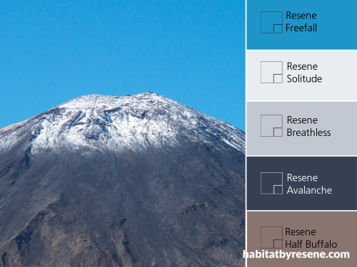
From a scenic hike through the Tongariro Crossing comes this breathtaking view. Bring it indoors with a palette of cool and dreamy Resene Solitude, splashes of vibrant Resene Freefall, and a dusting of Resene Breathless.
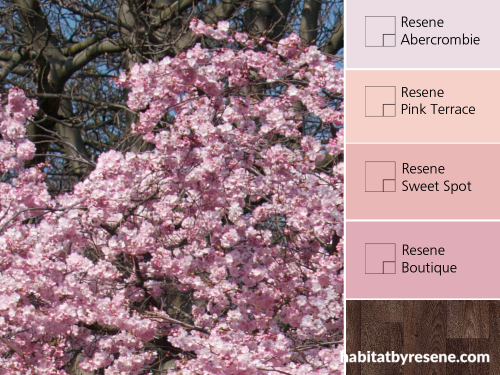
The ever-wonderful cherry blossom tree, and its dappled shades of pink, is our signal that spring has arrived – and with it, new beginnings. The soft pink tones of Resene Abercrombie, Resene Pink Terrace, Resene Sweet Spot and Resene Boutique are anchored by textured vinyl planking by Harrisons CarpetOne (code: Traffic 5626001).
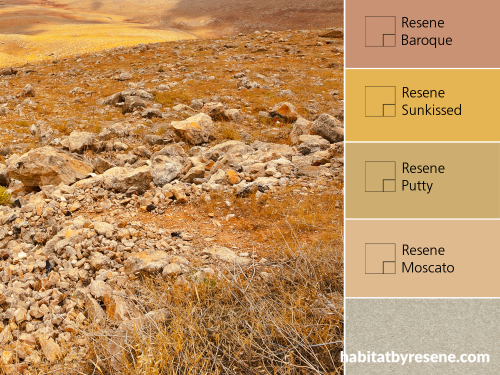
Rocks and suntanned tussock soak in the warmth of the sun, creating a palette of golden hues and beige-y neutrals. Think rustic tones of Resene Sunkissed, creamy Resene Putty and Resene Baroque, a gentle sandalwood beige. Layer with this creamy Capri 500 carpet from the Zen 3 range at Harrisons Carpet One (code: Capri 500).


the look
If you're stuck on what
colour to use or need colour
advice, try out the Resene
Ask a Colour Expert service.
more inspiration

A pair of heritage bathrooms clean up nicely
Renovating a heritage bathroom is a behemoth of an undertaking.… more

4 considerations for creating a home office that works
As we continue to handle more and more of our… more

Courageous colours to take your space from weary to wow
Brights and bolds may be just the thing you need… more

Even if you don’t live in an area where the… more

the look
If you're stuck on what
colour to use or need colour
advice, try out the Resene
Ask a Colour Expert service.

