
latest
habitat tv

Say goodbye to the morning scramble for keys, coats and sunglasses and hello to this… see this and more videos
blog

Precision and vibrancy with artist Cap Jacobs
Cap Jacobs is a New Zealand-based artist whose work stands out for its precision, vibrant… more
5 breezy Resene blues your clients will fall in love with
18 Jan 2023
Once the summer holidays have passed, it’s common for clients to approach designers looking for a change – especially if they spent their days off at home or at the bach. Chances are they’ve become acutely aware of the aspects of their home or bach they’ve become tired of after extra time within those familiar walls. The idea of shaking things up and making changes starts to appeal. The all-too-fast approach of autumn is also often a great time of year for clients to tackle smaller refreshes like painting and staining before the temperatures start to really drop.
When suggesting a new colour scheme, blue is often an easy colour for clients to say yes to – particularly when it comes to decorating baches, cabins and other holiday homes. The hue is well-known for its calming qualities and given most of these getaway homes are close to the water or wide-open skies, blue also emphasises the connection to nature and the building’s surroundings.
With so many blissful Resene blues to choose from, it’s great to have a shortlist of options as a starting point for making your suggestions to clients. We’ve rounded up some favourites that are sure to inspire you and your clients to come up with a fresh look for their rest and relaxation spaces.
Resene Half Halcyon
As we alluded to earlier, many describe the colour blue as serene. Yet, as a cool colour, blue can sometimes seem icy or distant. One the best tricks for ensuring your blue paint colours don’t give off a chilling effect is to choose variations with a yellow undertone.
Thanks to its sunny undertone, Resene Half Halcyon is hugely successful at evoking the comfort and calmness of a dreamy summer day. Play further to its warmth by teaming it with other cosy nature-inspired hues like surf blues, wheaten creams, buttercup yellows and stone greys in Resene Moby, Resene Scotch Mist, Resene Moonbeam, Resene Half Stack and Resene Mine Shaft for a palette that would play well in a homey, pastoral setting.
Finish the look with gingham or plaid patterned textiles, handmade pottery and organic elements from the outdoors like bouquets of fresh or dried flowers for an easy-to-live in space.

Background painted in Resene Half Halcyon, bowl in Resene Moby, jug in Resene Scotch Mist, tealight holder in Resene Moonbeam and tiny vases in Resene Half Stack and Resene Mine Shaft.
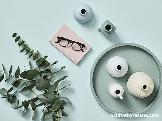
Resene Comfortably Numb
For those that find cooler blue paint colours crisp and refreshing, a blue with a greyed undertone can be really appealing. Resene Comfortably Numb has that precise quality. Despite having plenty of blue pigment to it, this colour’s rare ability to behave similarly to a neutral, makes for virtually endless colour pairing options. The colour also has timeless appeal, making it an ideal choice for clients who like to switch up their décor and accent colour palettes often to keep things fresh and on-trend.
Since Resene Comfortably Numb is a mid-range blue, it’s best to include both darker shades and lighter tints in your palette to keep everything feeling balanced. We love it in a monochromatic palette and as an accent to both steeped whites and crisp snowcapped whites such as Resene Half Tea and Resene Aoraki. By using both, you’ll have more options available for the types of other blues you can bring in. While Resene Half Tea sits well with greyed-off blues like Resene Duck Egg Blue, Resene Wayfarer and Resene Carpe Noctem, brighter Resene Aoraki opens the door for violet-edged periwinkle blues like Resene Polo Blue and Resene Time Out to add clean, contemporary flair.

Background painted in Resene Half Tea with A4 drawdown paint swatches in Resene Carpe Noctem, Resene Wayfarer, Resene Comfortably Numb, Resene Baring Head and Resene Aoraki, bubble vase in Resene Carpe Noctem and small bud vase in Resene Duck Egg Blue.
Resene Watermark
If your client has more traditional tastes, it’s virtually impossible to talk about breezy, summery colours without putting forward a Hamptons-inspired paint palette. A style that gets its name from the popular cottage destination on America’s east coast, Hamptons looks almost always include one or more beautiful blues.
While many clients may be drawn to lightly coloured walls when trying to emulate this look, we think it’s worth talking them into a darker option like Resene Watermark to add an air of intimacy to their space. Save lighter tones like Resene Double Alabaster and Resene Aoraki for trims and major furnishings and opt for softer blue hues like Resene Morning Haze and Resene Baring Head on wicker furniture to help these items blend better into the space. Remember to include patterned textiles and accessories like ginger jars and check out the Resene Wallpaper Collection for plenty of beach-inspired wallpaper designs to complement your client’s Hamptons-style space.

Background painted in Resene Watermark, shell in Resene Double Alabaster, patterned ginger jar in Resene Double Alabaster with design in Resene Watermark, faux coral in Resene Double Alabaster and Resene Morning Haze, slim vase in Resene Aoraki and ribbed vase in Resene Baring Head.
Resene New Day
When choosing blues for beachy exteriors, it’s important to take the project’s surroundings into context. While dark – particularly black – exteriors are hugely popular, chances are this colour choice would be too stark in most seaside settings. For the exterior of a beachy abode, we love the sea glass-like appearance of Resene New Day. The hue’s green undertones will have it swimming beautifully with the tones of the sea, sky and surrounding bush – especially if there’s any eucalyptus about. Try trims in a classic cream like Resene Creme De La Creme and a brick red for the roof, such as Resene Pioneer Red, for contrast.

Background painted in Resene New Day, tray in Resene Infused, book in Resene Contented and painted vases (on tray) in Resene Creme De La Creme, Resene Timeless and Resene Comfortably Numb.
Resene Colorwood Rising Tide
Is there anything more quintessentially ‘beachy’ than timber in a washed finish? For a solid summery vibe to your project, you won’t want to pass up Resene Colorwood Rising Tide. With everything you love about Resene’s traditional whitewash and greywash finishes, Resene Colorwood Rising Tide has the added beauty of blue-tinted pigment. Launched last year as part of the Resene ‘We Speak Beach’ palette of tinted Resene Colorwood wash finishes, Resene Colorwood Rising Tide became a quick favourite for timber walls and accents. For flooring, you can also try deeper Resene Colorwood Shade – which too imparts a blueish hue – balanced with walls in Resene Concrete. Finish the look with painted objects in sandy tones like Resene Gold Coast and timber accessories in Resene Colorwood Bask.

Background painted in Resene Concrete, floorboard finished in Resene Colorwood Shade, bowl finished in Resene Colorwood Rising Tide, beaded wood décor object finished in Resene Colorwood Bask, vase and book in Resene Gold Coast and tealight holder in Resene Nocturnal.
For the latest colour trends, be sure to check out the Red Alert section in the most recent issue of BlackWhite magazine and look to the Resene The Range fashion colours fandeck for a curated collection of the most relevant on-trend hues.
projects Kate Alexander, Laura Lynn Johnston, Vanessa Nouwens, Melle Van Sambeek
images Bryce Carleton
Published: 18 Jan 2023
more inspiration

Product of the month: Resene plant-based paints
It’s great to see the demand for sustainable and eco-friendly… more

Meet the team: Phillip Willemse
What is your role at Resene and what does it… more

The mood of May: Why this deep, vivid hue is the colour of the month
Color Marketing Group (CMG) have announced the latest hue that… more

Design Experience 2025: Unlocking opportunities in architecture and urbanism
Design Experience showcases some of the leading names in architecture… more

Award-winning holiday home documentary opens Resene Architecture & Design Film Festival
After four years of filming, the journey of the Chodge,… more


 look book