
latest
habitat tv

Say goodbye to the morning scramble for keys, coats and sunglasses and hello to this… see this and more videos
blog

Precision and vibrancy with artist Cap Jacobs
Cap Jacobs is a New Zealand-based artist whose work stands out for its precision, vibrant… more
6 soothing colour selections to use where comfort is key
10 Mar 2023
Given the undeniable and transformative impact that colour has on a project’s design, your paint, stain and wallpaper selections go an awfully long way in setting the overall tone of the space you’re working on. Even when your client doesn’t have a particularly strong idea of how their finished project is going to look – after all, that’s why they hired you to help them – it’s likely that they at least have a notion of how they want the space to feel when they’re in it.
As external stressors and the pressures of everyday life continue to mount and take their toll on our mental wellbeing, one of the most common requests designers have been receiving is a desire for a soothing, relaxing and comforting sanctuary. Whether the project is a home, office, shop, restaurant, café, spa or hotel, it’s hard to imagine a place where humans will be spending time that wouldn’t benefit from a little more zen. While the paint, wallpaper and wood stain choices may not be the project’s most costly investments, they’re exceedingly important for getting that vibe just right.
Check out these seven tried-and-tested picks from the BlackWhite editorial team – including some potentially new-to-you hues from the latest Resene The Range fashion fandeck – that are perfect for infusing a sense of solace in just about any space.
Resene Westar
An all neutral colour scheme made up of warm stone grieges and beiges married with natural textures has become somewhat synonymous with upwardly mobile and style-savvy young professionals. Just like your favourite flawless ‘I woke up this way’ celebrities, nailing an unobtrusively chic, harmoniously homogenous colour palette actually takes some effort and clever curating. But with a hero hue like Resene Westar, that covetable effortlessness is well within reach when combined with other powerhouse character neutrals. Resene Napa, Resene Half Napa, Resene Rodeo Drive and Resene Eighth Canterbury Clay each carry their own inherent ‘je ne sais quoi’ and sufficiently bring the right levels of contrast to the table to create interest without disrupting the peacefulness that Resene Westar exudes.

Background painted in Resene Westar with swatch of Resene Wallpaper Collection 36001-3, A4 drawdown paint swatches in Resene Half Napa and Resene Napa and large vase in Resene Groundbreaker. Accessories and throw from Thread Design.
Resene Leather
When it comes to cosiness, few colours can compete with the understated warmth of Resene Leather. This placid tanned brown has a complex rosy edge that can be coaxed out with the right combination of light direction and supporting colours. When paired with graceful mauve, pinky and creamy browns like Resene Soul Searcher, Resene Awaken, Resene Soiree and Resene Half Sour Dough under warm light, Resene Leather feels cocooning and reassuring without being too dominant. But even if pinks aren’t your client’s first pick, this versatile brown also blends beautifully with warm beiges like Resene Coral and Resene Calico or timeless blues like Resene Duck Egg Blue and Resene Watermark while still radiating reassurance and an air of relaxation.

Wall painted in Resene Leather, cabinet in Resene Coral and ribbed vase (with branches) in Resene Calico. Floating shelf and marble vase from Città, white bottle vase from Domo.
Resene Quarter Linen
Undoubtedly, green tones have continued to be among the most popular accent colours over the past three years and counting – and with good reason with the unquestionable connection to nature that green colours carry. A soothing off-white that gets its fine flaxen charm from a touch of warm green in its undertone, Resene Quarter Linen is just the ticket when you need a neutral with just a hint of earthy colour. Even your most colour cautious clients will appreciate the sophistication that this subtle character neutral brings. They might even be open to bringing in a little more chroma through accents once they see how truly calming and comforting Resene Quarter Linen looks when teamed with soft pastel tones like Resene Field Day and Resene Avocado. For more warmth, blend some warm classic beiges like Resene Foundation and Resene Pearl Lusta into your palette and add depth with smoky Resene Triple Masala and Resene Off The Grid, a green-edged grey, for a well-balanced colour scheme.

Background painted in Resene Quarter Linen with A4 drawdown paint swatches in Resene Foundation (left) and Resene Triple Masala (right), bowl with rope handles in Resene Triple Masala, basket lids in Resene Field Day (top) and Resene Pearl Lusta (bottom), large shell in Resene Tea, ribbed vase in Resene Avocado and skinny amphora vase in Resene Off The Grid.
Resene Cobblestone
For clients with a healthy appreciation for an array of nature-inspired colours with a bit more pigment, finding the right mid-range colour that can work just as well with greens as it does with golds, browns, blues, greys, violets, reds and oranges is quite the challenge – or at least it is until you discover the power of Resene Cobblestone. A chameleon colour if there ever was one, Resene Cobblestone morphs and changes into whatever you need it to be. Not quite grey, not quite khaki, using this colour for this first time is like discovering a superpower you never knew you had. We love it with white linen furnishings, timber flooring stained in Resene Colorwood Natural and a few accents in Resene Burgundy, Resene Tuscany and Resene Raptor for a tranquil waiting area where no one would mind if their appointment was running a little late.

Background painted in Resene Cobblestone with A4 drawdown paint swatches in Resene Thorndon Cream, Resene Credence, Resene Quarter Thorndon Cream, Resene Thunderstorm, Resene Cobblestone and Resene Quarter Lemon Grass, textured artwork in Resene Half Lemon Grass, small amphora vase in Resene Thunderstorm, tiny round vase in Resene Quarter Thorndon Cream and wooden vase in Resene Colorwood Natural.
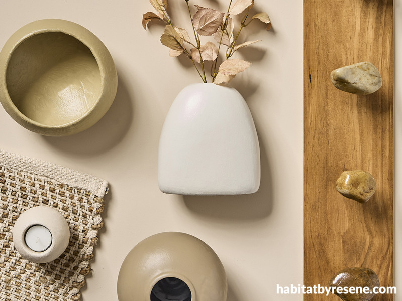
Resene Biscotti
As cold, flat greys begin to fall more and more out of favour, warm biscuit beiges are quickly gaining traction as the preferred neutral. Just like the fresh baked treat it’s named for, Resene Biscotti is deliciously toasty and comforting. Try it as the base of an extra cosy Scandi look with other warming beiges and creams like Resene Colins Wicket, Resene Cement and Resene Quarter Thorndon Cream along with natural elements like timber finished in Resene Colorwood Whitewash and Resene Colorwood Ironbark, chunky woven rugs and stone accents.

Background and tealight holder painted in Resene Biscotti, low bowl in Resene Colins Wicket, vase with foliage in Resene Quarter Thorndon Cream, round vase in Resene Cement and coat rack stained in Resene Colorwood Ironbark with rock ‘pegs’ sealed in Resene Concrete Clear gloss.
Resene Kia Kaha
Upon the release of Resene’s latest collection of fashion colours, we were quick to fall in love with newcomer Resene Kia Kaha. This dreamy, smoky brown oozes easy elegance and luxury, enveloping the spaces it’s used in with calmness. Used on the walls and ceiling of a restaurant, we imagine that patrons would never want to leave. It works wonders with metallics from rose gold to brass to copper or silver, looks luscious with berry tones like Resene Staccato, classic with a snow white like Resene Aoraki and impossibly cool with trending hues like Resene Heliotrope and Resene Open Sesame.

Background painted in Resene Kia Kaha, tray in Resene Stepping Stone, bowl in Resene Courtyard, ribbed vase in Resene Foundation and tiny pots in Resene Boris (left) and Resene Sea Fog (right). Fabric from Martha’s Furnishing Fabrics, carpet from Bremworth.
Still on the lookout for the tranquil tone? Check out the newest Resene The Range fashion fandeck for the latest colour trends or the Resene The Range Whites & Neutrals collection for other popular picks. As always, be sure to test your colours in-situ (when possible) before you commit. If you’re working on a new build and won’t be able to see your chosen colours on site before they need to be specified, it’s best to at least order A4 drawdown paint swatches of those you’re planning to build your palette out of so that they can be viewed together at a larger scale and you and your client can be more confident with the colour selections.
projects Kate Alexander, Amber Armitage, Vanessa Nouwens, Melle van Sambeek
images Bryce Carleton, Wendy Fenwick
Published: 10 Mar 2023
more inspiration

Product of the month: Resene plant-based paints
It’s great to see the demand for sustainable and eco-friendly… more

Meet the team: Phillip Willemse
What is your role at Resene and what does it… more

The mood of May: Why this deep, vivid hue is the colour of the month
Color Marketing Group (CMG) have announced the latest hue that… more

Design Experience 2025: Unlocking opportunities in architecture and urbanism
Design Experience showcases some of the leading names in architecture… more

Award-winning holiday home documentary opens Resene Architecture & Design Film Festival
After four years of filming, the journey of the Chodge,… more


 look book