
latest
habitat tv

Say goodbye to the morning scramble for keys, coats and sunglasses and hello to this… see this and more videos
blog

Precision and vibrancy with artist Cap Jacobs
Cap Jacobs is a New Zealand-based artist whose work stands out for its precision, vibrant… more
Squisito Trattoria inspired by the exquisite shades of the Italian coastline
10 Feb 2023
The colours that bounce off the walls of Squisito Trattoria recall the terracotta tiles, sunbaked earth and deep blue coastline of Tuscany and Sorrento. Interior designer Steve Reid has made good use of Resene paints and colours to recreate the palette of these popular Italian destinations for this traditional European restaurant in Auckland’s Herne Bay.
When owners Tony Matches and Buki Prekazi came to Steve for help with their new restaurant, it wasn’t just the interior design they put in Steve’s hands, it was the name too. Steve has known Tony for many years and has chosen the colour schemes and names for many of his restaurants, so when this project came along, Steve was the only man for the job.
Squisito means ‘exquisite’ in Italian, and the owners describe their beloved restaurant as ‘Squisito Trattoria, Refined Rustic’. Trattoria typically means a restaurant which serves local, traditional food; a philosophy they plan to uphold.
Resene Tuscany was used for the walls and base for Squisito, with Resene Dawn Glow for the ceiling, a lighter, sister shade to Resene Tuscany. Once Steve had his main colours, he worked in a deep blue green shade of Resene Sea Green, as seen along the coast looking out to the Mediterranean Sea.
Steve started by thinking about how he wanted customers to feel when they entered Squisito, and decided that was as though they were in a cosy Italian restaurant on the Sorrento coast, surrounded by everyday warm shades, sipping good wine and talking to friends.
Violet-blue Resene Governor Bay was painted on the ceiling beam to really cut through the other shades and create some drama. Painting architecture features can be an excellent way to add different colours, or create a visual separation between two areas of one room.
This same shade was used for the woman’s bathroom, and Steve, with his love of murals and classy artwork, drew a woman’s face in line art with a quote “Last night I dreamt of Sorrento, tonight I intend to do the same.” Steve says he would love to add many more quirky things on the walls to make them more intriguing, and these little touches often help to bring a theme together.
Near the kitchen, Resene Black was used as a contrast anchor colour.
“I think this black lets serious diners know we are not afraid,” Steve says. “We also used Resene Black in parts of the kitchen for a professional look, and it worked.”
After much protest that he couldn’t choose, Steve says one of his favourite parts of the finished space is a seat by the window near a guitar-based artwork. Steve created this himself to bring together all the colours used throughout the restaurant, and as a ‘3D’ element for visual interest. Creating your own artwork, using colours from your interior scheme, is a great way to create a harmonious look in the space.
With a background in graphic design, self-taught interior designer Steve has painted murals and chosen colour schemes for restaurants and clients for over 30 years.
“With Squisito, I knew I wanted it to symbolise Tuscany, terracotta, green blue for the sea around the coastline, with some added black for sophistication. I wanted it to be colourful, but classy.”
With an abundance of Resene colours, Steve couldn’t land on just one as a favourite, but he says that everything on the deep green, blue, purple spectrum is always somethings that catches his eye and evokes great feelings.
“I absolutely love Resene. When I discovered it years ago, I thought, ‘here is a paint I can relate to’!”
“’I love Resene Lumbersider’, will be on my gravestone.”
Steve has worked with Tony since his first restaurant Copacabana opened in the 1980s.
“It was a riot of colour and Tony gave me full permission to do it how I wanted,” says Steve. “From then on he knew I would be choosing the colours.
“While I was working on the colours at Squisito, I would anticipate Tony and Buki coming in to see what I had come up with. Lucky for me, they always loved the result!
Steve’s legacy of restaurant interiors includes Café Gero – his first, to Villa d’Vine and Mango Tango. Each one of them has been as colourful, classy and exquisite as the next.
Visitors to Squisito will find the vibrant colour scheme matched with vibrant wines and traditional foods along with unique art and classical guitar tunes.
“The music in the restaurant is modern Italian guitar, to create the feeling of relaxing in the sea breeze when you’re sitting on the dock in Sorrento,” says Steve. “Every detail, from the colours to the music, is what creates this space.”
To get a taste of Squisito and book in your next visit: www.squisito.co.nz
Contact Steve: reids4371@gmail.com

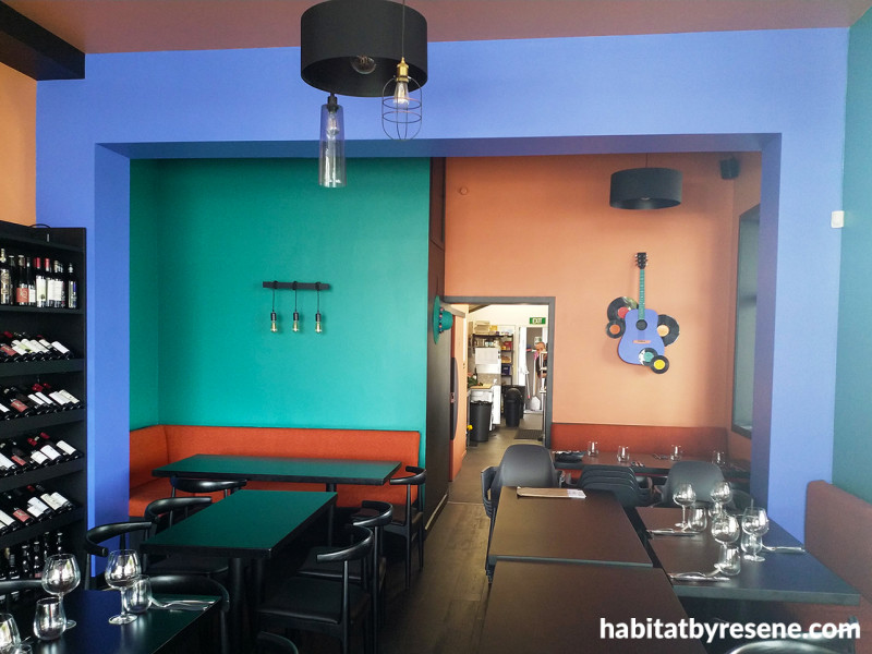
The colours of Tuscany and Sorrento bounce off the walls and look even better in the mood lighting of an evening dinner service. The walls are painted in Resene Tuscany and Resene Sea Green, with Resene Black on the wine shelf and trim. The blue beam is in Resene Governor Bay and the ceiling in Resene Dawn Glow.

An array of European wines resting in their Resene Black shelf, underneath the Resene Tuscany wall, with adjacent wall in Resene Sea Green and beam in Resene Governor Bay.

These modern industrial style light fixtures pair match the notes of Resene Black, and contrast nicely against the ceiling in Resene Dawn Glow, beam in Resene Governor Bay and walls in Resene Tuscany and Resene Sea Green.

Steve’s artwork, a 3D guitar with vinyls, is painted in the colours of the restaurant - Resene Governor Bay, Resene Tuscany, Resene Dawn Glow and Resene Sea Green. The wall is painted in Resene Tuscany and trims in Resene Black.

Resene Sea Green walls are reminiscent of the Mediterranean. A pop of Resene Governor Bay on the beam provides contrast. The seating upholstery colours have been chosen to match the terracotta tiles of Tuscany and Sorrento buildings.

The men’s bathroom is painted in Resene Tuscany and Resene Crail with pops of Resene Black on the trims and walls for a sophisticated, simple finish.

Resene Governor Bay was used on the feature wall of the women’s bathroom, the perfect backdrop to Steve’s line art. Other walls and the door are painted in Resene Tuscany with Resene Black on the trim.
Published: 10 Feb 2023
more inspiration

Product of the month: Resene plant-based paints
It’s great to see the demand for sustainable and eco-friendly… more

Meet the team: Phillip Willemse
What is your role at Resene and what does it… more

The mood of May: Why this deep, vivid hue is the colour of the month
Color Marketing Group (CMG) have announced the latest hue that… more

Design Experience 2025: Unlocking opportunities in architecture and urbanism
Design Experience showcases some of the leading names in architecture… more

Award-winning holiday home documentary opens Resene Architecture & Design Film Festival
After four years of filming, the journey of the Chodge,… more


 look book